

Why these successful homepages actually head off most homepage problems
March 26, 2021
Ever land on a website and instantly knew the site was what you were looking for? Both interesting and intriguing. Speaks to what you need. That’s a sign of a great homepage.
Homepages, also called Home or Main, is the most important content of a website. The second most important is the About page, but that’s for a different blog post.
The homepage is the first impression a visitor has of your website and your business. In 5 seconds, you must grab the attention of those potential customers and keep them on your website. If they don’t see what they want or, better yet, provide value that resonates with them, they are on to the next website. That could be your competitors website.
So what is that magic formula to making a great homepage? Let’s go over what makes a high performing homepage. Here are some perfect examples to illustrate each point.
Hero Section
Your customer’s first impression of your business sits on the top of your homepage, aka the Hero section. With 5 seconds to grab attention, this valuable real estate must quickly compel a customer to stay and take action.
Hero sections must dive straight into the value of your website. The “why should I stay” value. Then follow up with the main action you want customers to take. Combining both value and action and you have a powerhouse to meet the overall business goal for the website.
Dubsado, for example, has a hero section that’s clean and straight to the heart of what they do for customers. The headline explains the value their platform can do to make day-to-day business tasks a breeze.
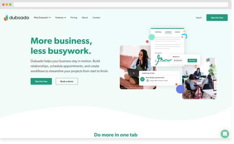
Through the simple catchy headline, straightforward supporting subheading, and eye popping imagery, the hero section attracts those customers looking to streamline their business.
Graphics
If you noticed in the previous example, the graphics supported the value-based messaging in the hero section. The imagery explains the same value as the copy and in visual forms.
Graphics and visual branding secretly speaks to your customer. They express a message, a feeling, a mood, and a personality about your products, services, and your business.
If your website’s graphics mismatches with your messaging, your brand, or just doesn’t resonate with your ideal customer, customers will leave your website. If the design hinders your messaging through awkward layouts, more than three fonts, and misaligned elements, a customer will walk away.
We’ll look at Renude for a great example of design. The imagery and graphics they use throughout the homepage supports the messaging and focus of their products. They showcase their product throughout the homepage. With picture after picture, the website focuses on how to use the product, the benefits of using it, and demonstrating the lifestyle of it.
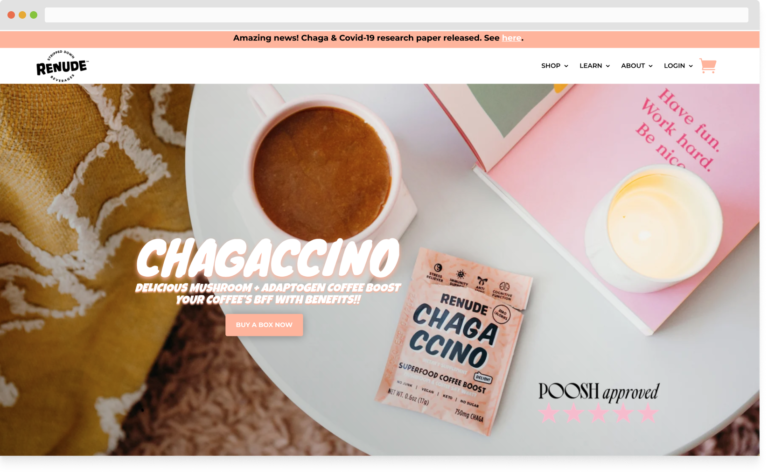
The colors, fonts, and spacing provides a vibe to showcase their product. They place the product as the center topic.
All of the design focuses the homepage on one topic and one goal: Renude’s product. In the end, so does the customer’s attention.
Copy
Alongside graphics, amazing copy attracts customers by providing intrigue, a feeling, and highlighting the value. One line of great copy draws in your ideal customer to explore the rest of your site or take action.
Hello Fresh’s great copy throughout it’s homepage centers on what their ideal customer would benefit from their service. The simplicity and clean copy speaks to the easy, clean, and refreshing service they provide. Each section of the homepage clearly states the value of their service, the benefits, and answers any questions along the way.
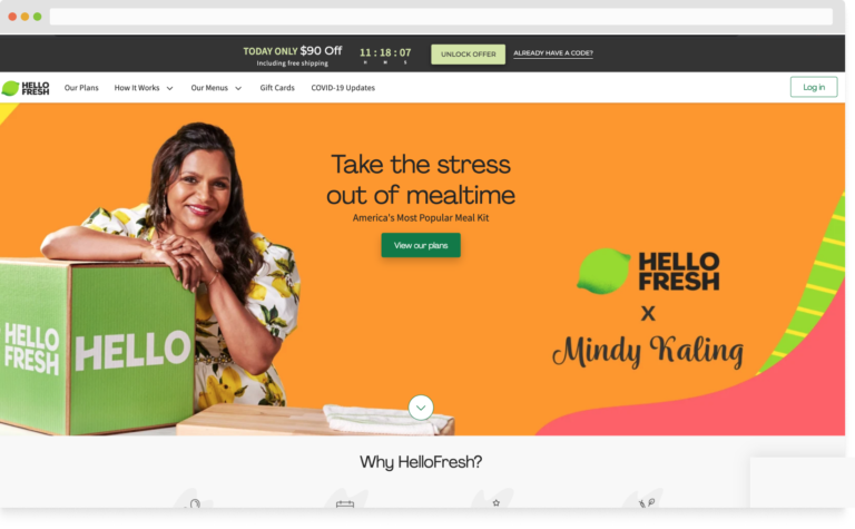
Notice how they don’t use a lot of words. Great copy doesn’t mean lengthy explanations. Just to the point, in the tone of your brand, and clearly speaking the message you want your customers to take away.
Call To Action
Good websites know what information their ideal customer needs. A great website understands how to use this information and lead them to take action, aka Call To Action. Take the opportunity to lead the horse to the water. Guide customers to take the action you want them to take. Schedule an appointment, purchase a product, or sign up for my services.
Dreamhost’s homepage contains more than one Call To Action and designed to not confuse a customer on what to do first.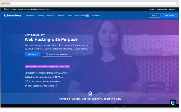
The main Call To Action stands out first. The design and copy focus the customer to “Get Started” and take a journey that Dreamhost guides them through. If a customer knew what they were looking for, they could skip the first Call To Action and continue onto the rest of the page. With many Calls To Action, the homepage has a few chances to attract customers.
Social proof
A website can talk on length about a business, service, or product. For some customers, this might sound too good to be true. How do you know the benefits or value a website speaks to be legit? In comes social proof.
Social proof puts a beautiful bow on top of your amazing products and services. It’s the seal of approval. The reviews, results, and testimonials from customers validates what the copy says on the page. That your website can back up it’s claims with customer after customer feedback or results.
Let’s go through a few ways to integrate social proof into a homepage.
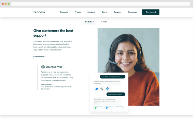
Zendesk incorporates social proof on its homepage through the power of storytelling. They embed the review from Squarespace as a side note next to the copy of a benefit. Solidifying the truth in their claims of their product.
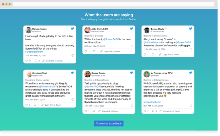
Quote after quote from customers displayed on a page showcases another way to place social proof on a homepage. ScreenToGif arranges a grid of client tweets to boost the credibility of their products. Who can argue against an army of tweets?
This tip is a subtle reminder to ask your customers for reviews, grab the social proof you need to bring in more sales and highlight the credibility of your business.
With these points in mind, how does your homepage add up? Do you have a Call To Action? Does the graphics match the messaging? Do you back it up with social proof?
Your homepage is the most important page of your website. Don’t waste all the effort and time to attract customers and then turn them away with a poor performing homepage.
-- Mary Jo